An identity for Western Canada's largest industrial distribution and logistics centre.
The Challenge
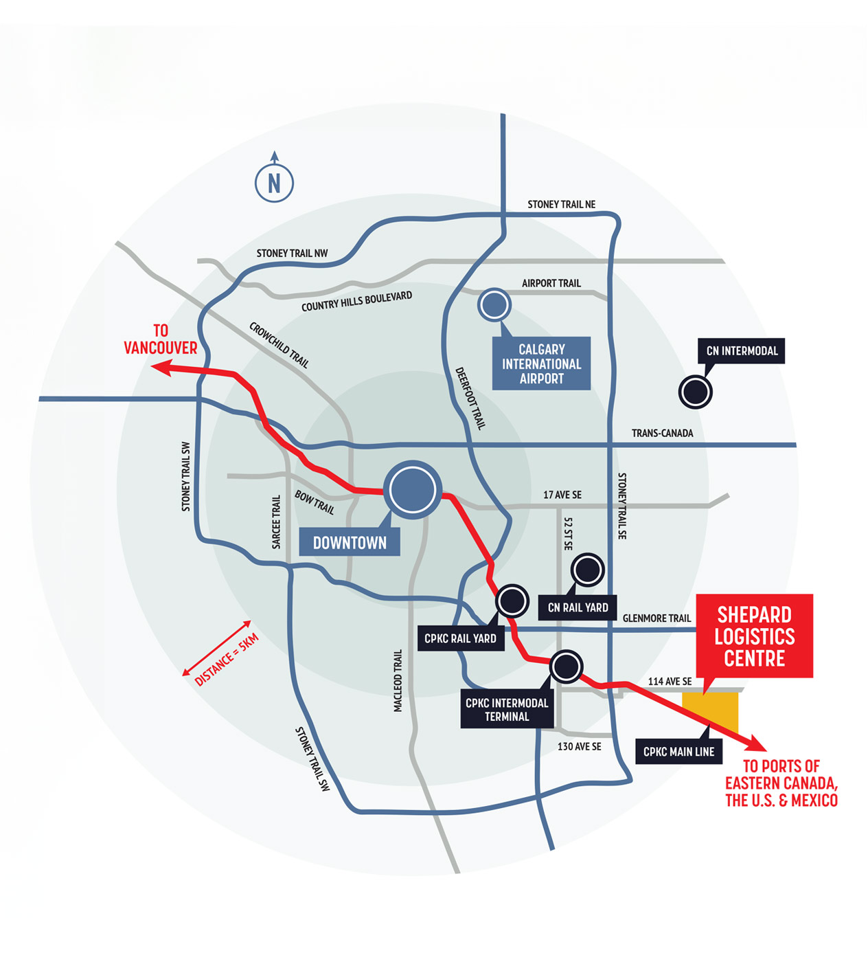
The Shepard Logistics Centre is a large-scale industrial rail and trucking distribution site, bordering the City of Calgary and adjacent to CP Rail. This significant development project required a strong logo, brand identity, and messaging to build excitement and momentum as it moved through the RFP process and to present and promote the site to municipalities, potential customers, and key stakeholders.
The land this development sits on has historical and agricultural significance dating decades back to the ranching heritage of the family behind the project. This presented an opportunity to create a brand identity that brings together the ranching heritage of the land and its longstanding connection to CP Rail.
The Solution
The identity was developed around the connection between these two histories, bringing together the agricultural heritage of the land and its future as a major rail and logistics hub.
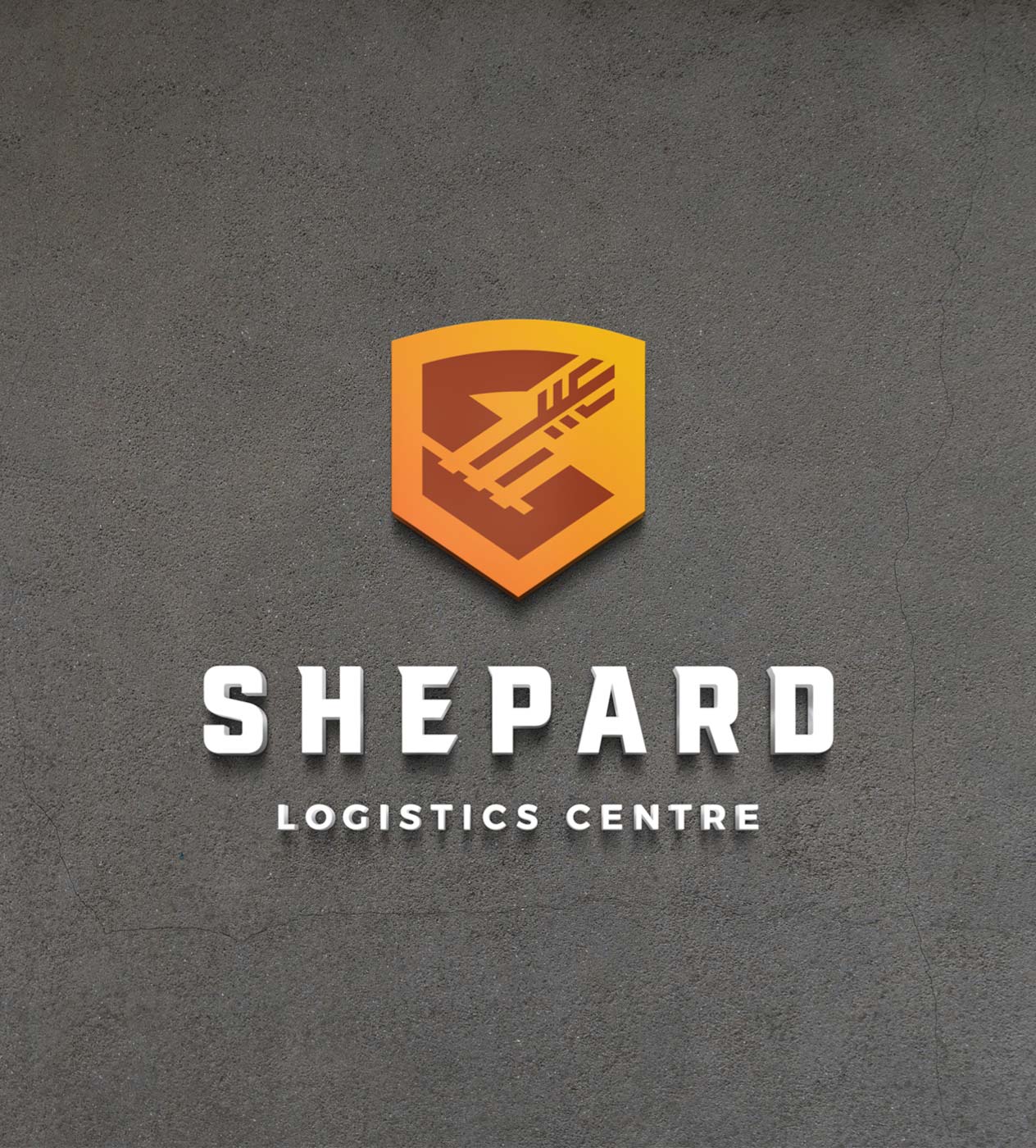
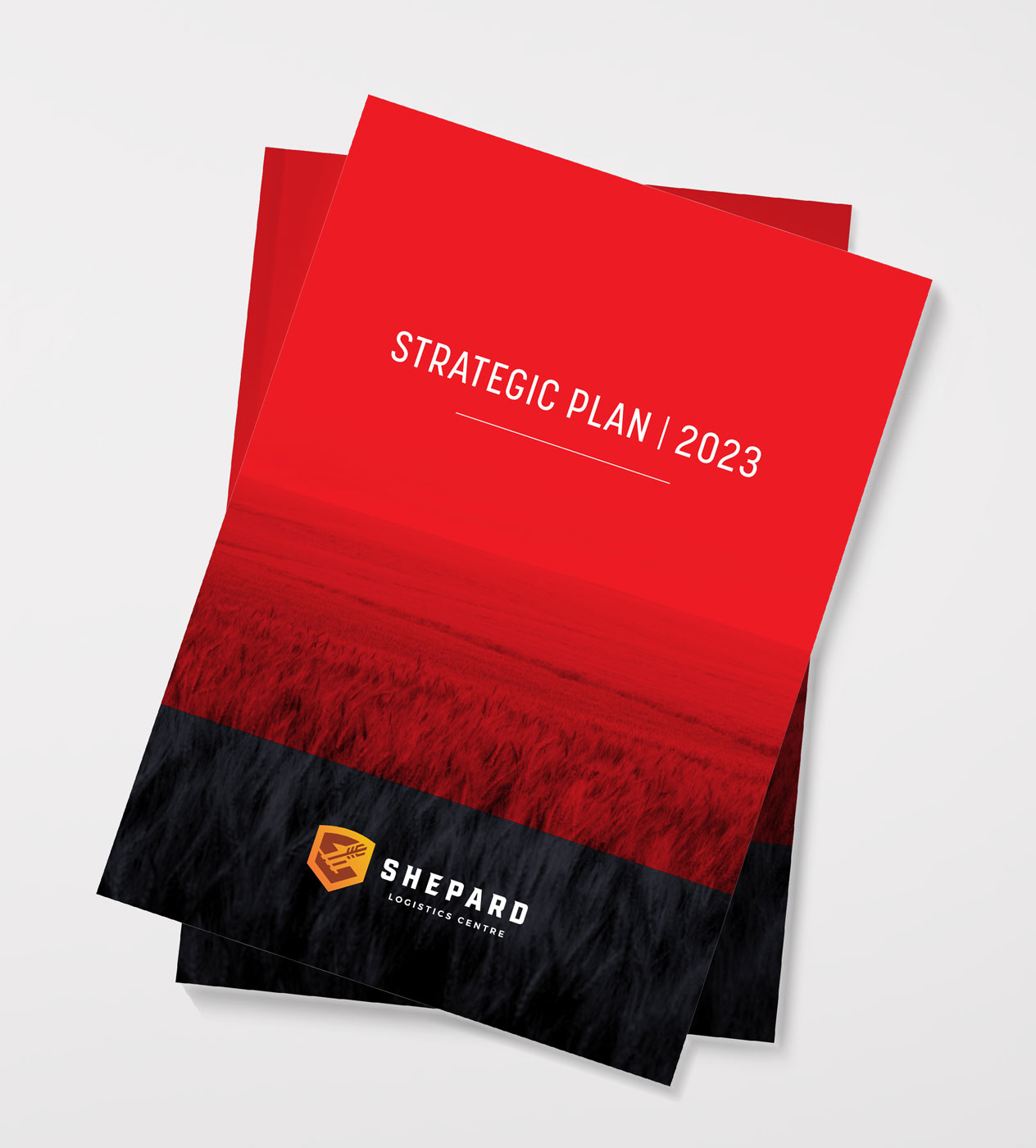
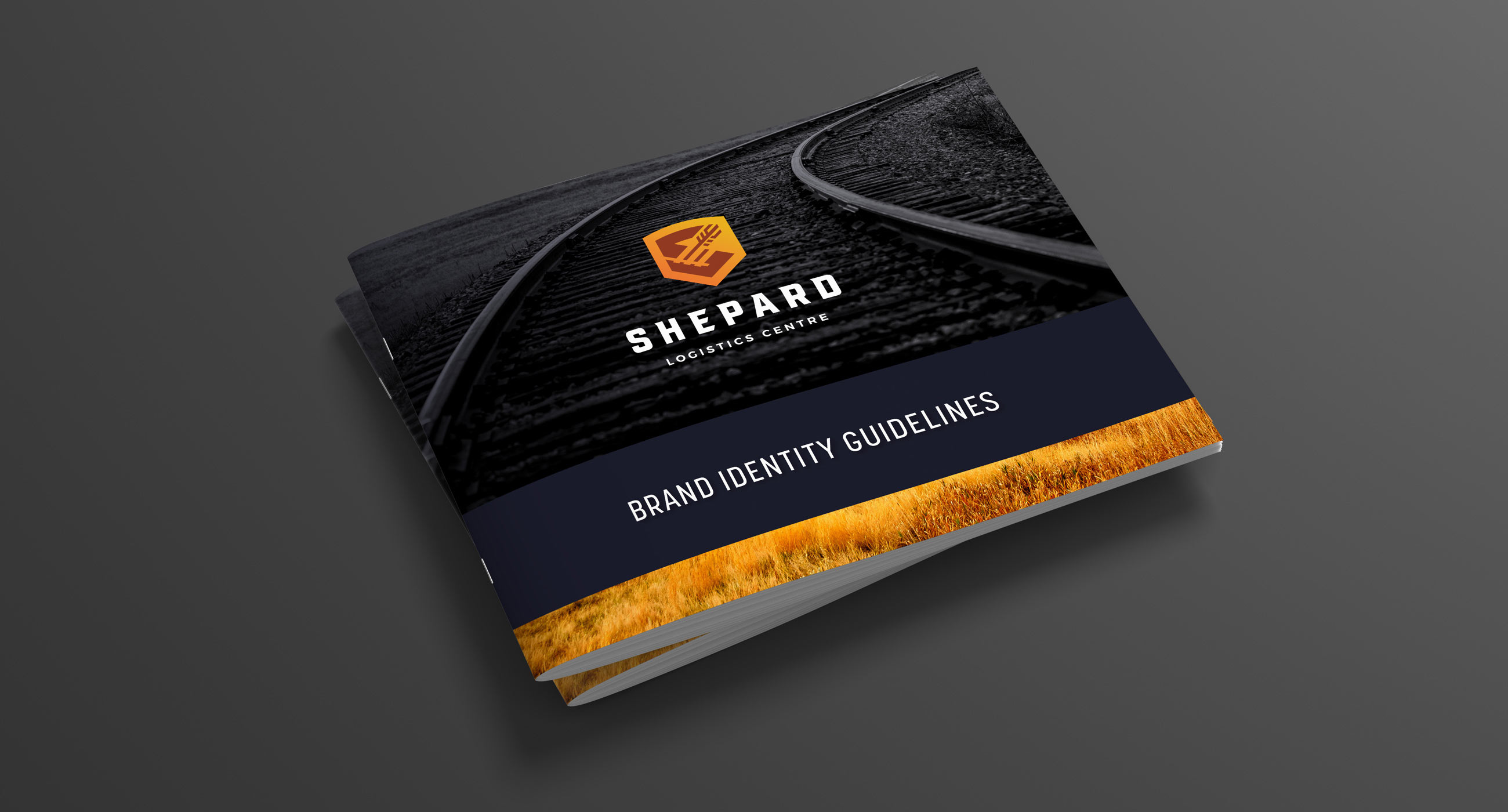
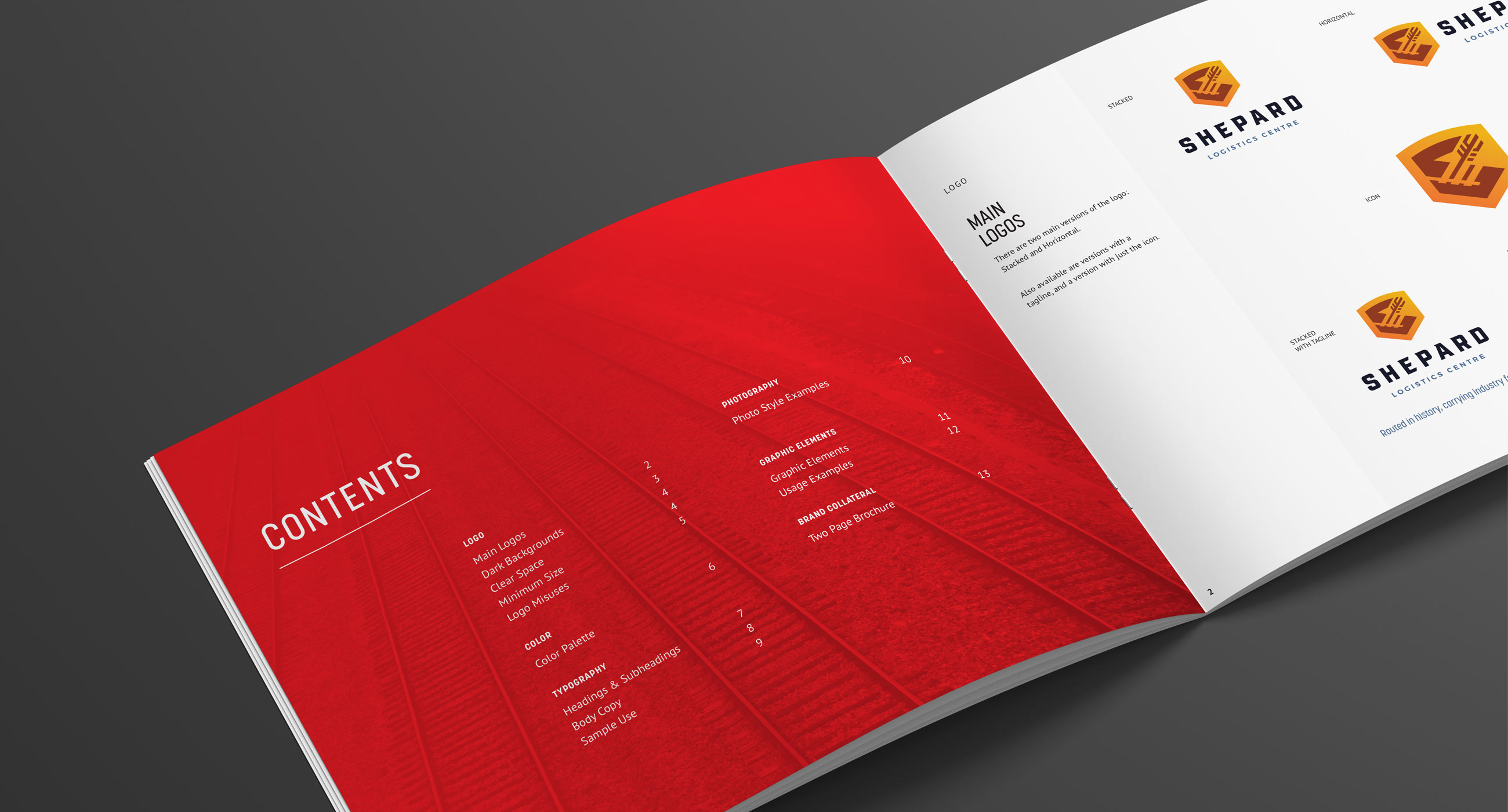
The resulting crest-shaped logo uses gold tones and draws inspiration from CP’s historic logos over the past century. The icon also combines symbols to represent the agricultural significance of the land and its future as a rail hub. The overall identity is bold, simple and strong, with heavy use of red to tie into CP. Imagery of rail and agriculture is used throughout the identity to reinforce the connection between the site’s past and future.
The Shepard Logistics Centre is a large-scale industrial rail and trucking distribution site, bordering the City of Calgary and adjacent to CP Rail. This significant development project required a strong logo, brand identity, and messaging to build excitement and momentum as it moved through the RFP process and to present and promote the site to municipalities, potential customers, and key stakeholders.
The land this development sits on has historical and agricultural significance dating decades back to the ranching heritage of the family behind the project. This presented an opportunity to create a brand identity that brings together the ranching heritage of the land and its longstanding connection to CP Rail.
The Solution
The identity was developed around the connection between these two histories, bringing together the agricultural heritage of the land and its future as a major rail and logistics hub.
The resulting crest-shaped logo uses gold tones and draws inspiration from CP’s historic logos over the past century. The icon also combines symbols to represent the agricultural significance of the land and its future as a rail hub. The overall identity is bold, simple and strong, with heavy use of red to tie into CP. Imagery of rail and agriculture is used throughout the identity to reinforce the connection between the site’s past and future.