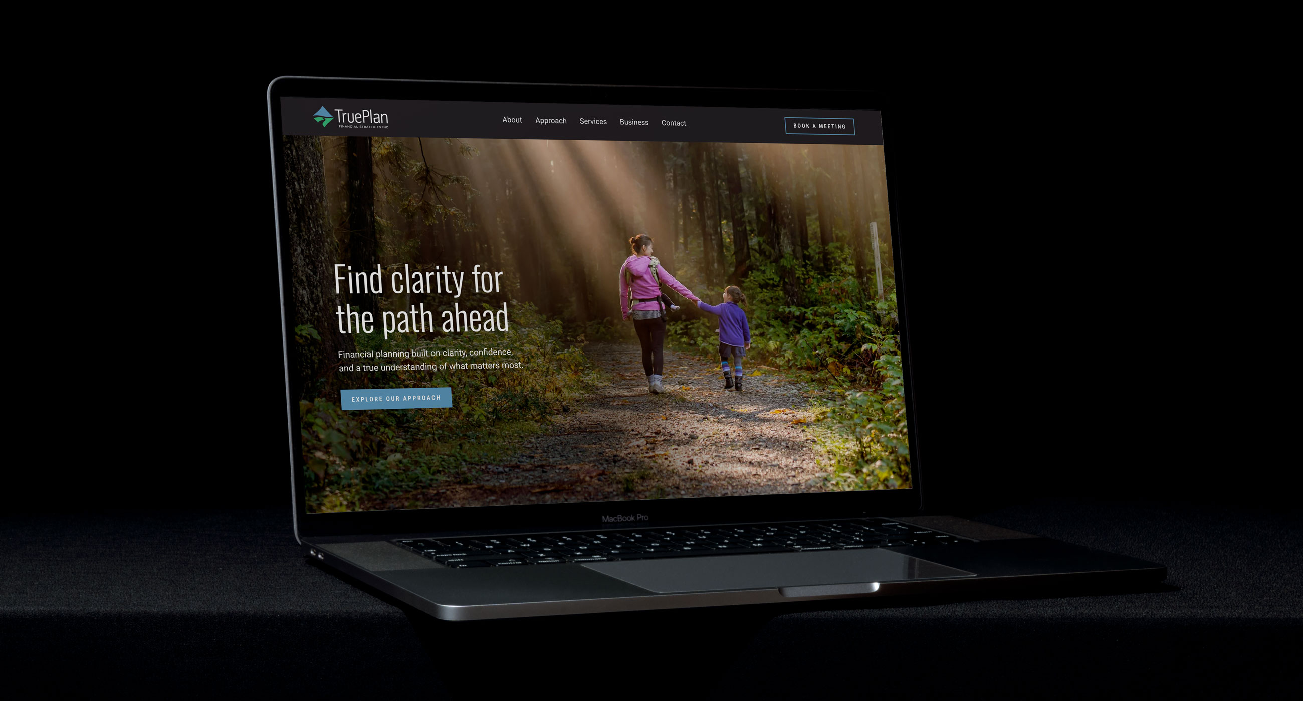
Website design for a Calgary-based financial planning firm.
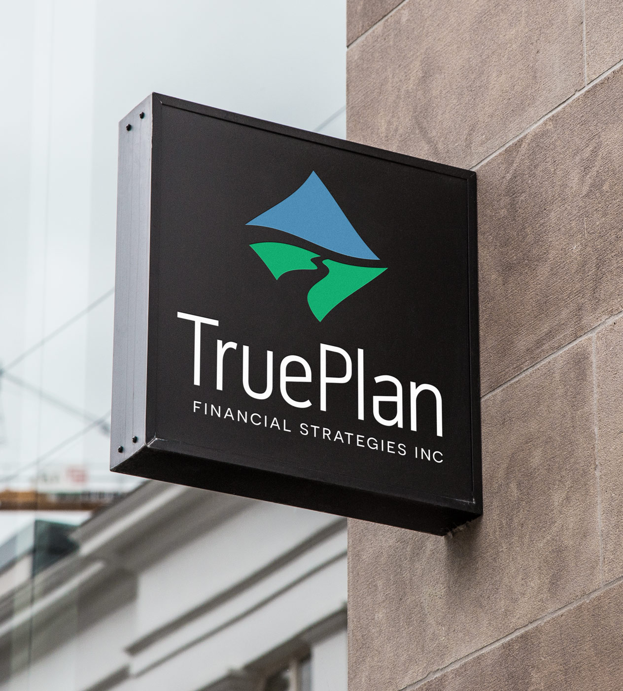
I originally designed the TruePlan logo several years ago, and the core identity still felt relevant. The typography remained strong, and the mark — a stylized mountain landscape with a pathway forming a “T” in the negative space — continued to communicate direction, movement and the idea of finding the right financial path. Rather than redesigning it, I simply refreshed the colour treatment.
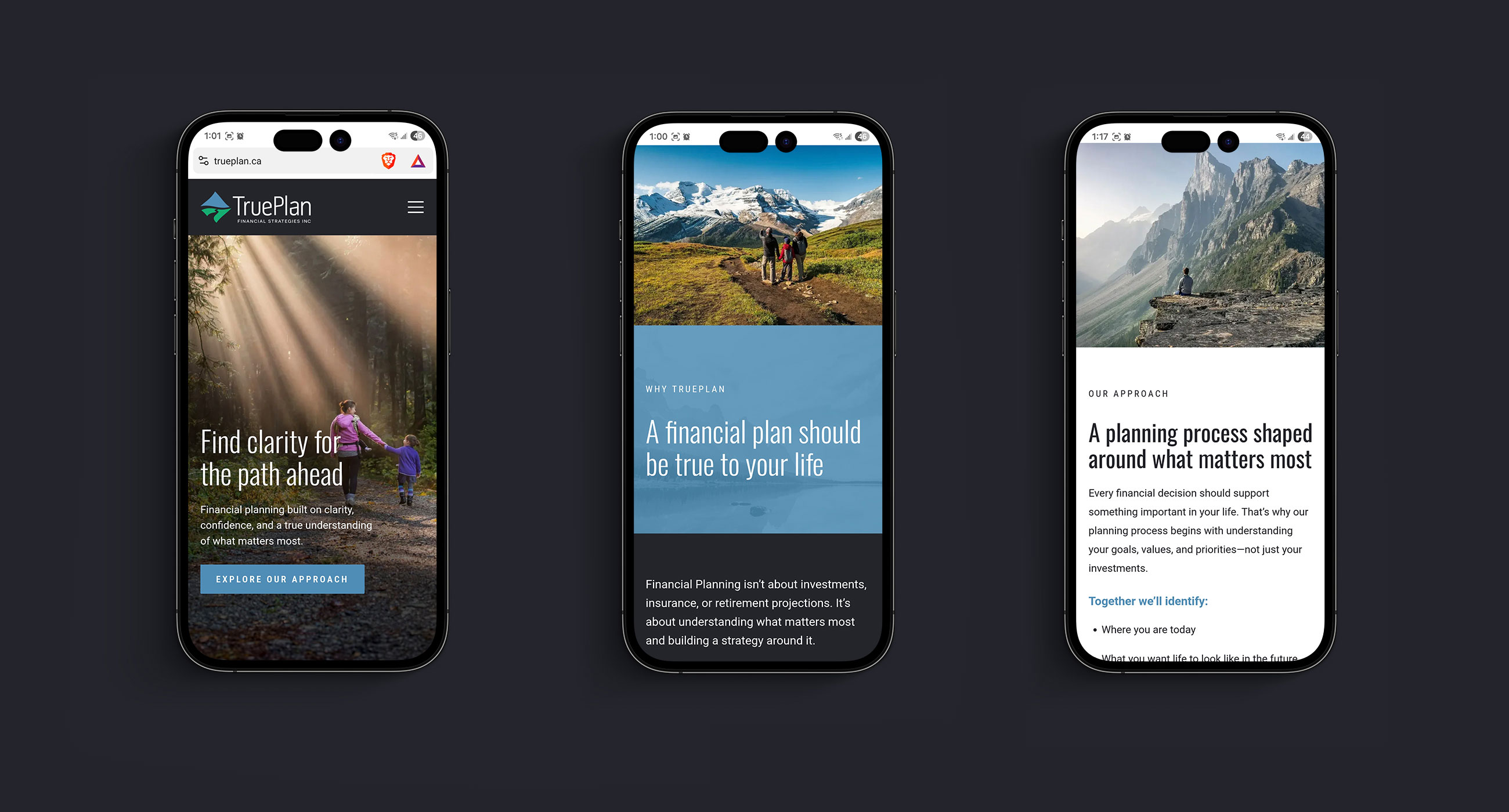
When the time came to design the website, that same idea provided a natural creative direction. Mountain landscapes, pathways and views into the distance reinforce themes of clarity, perspective and long-term planning, while creating a visual connection back to the logo.
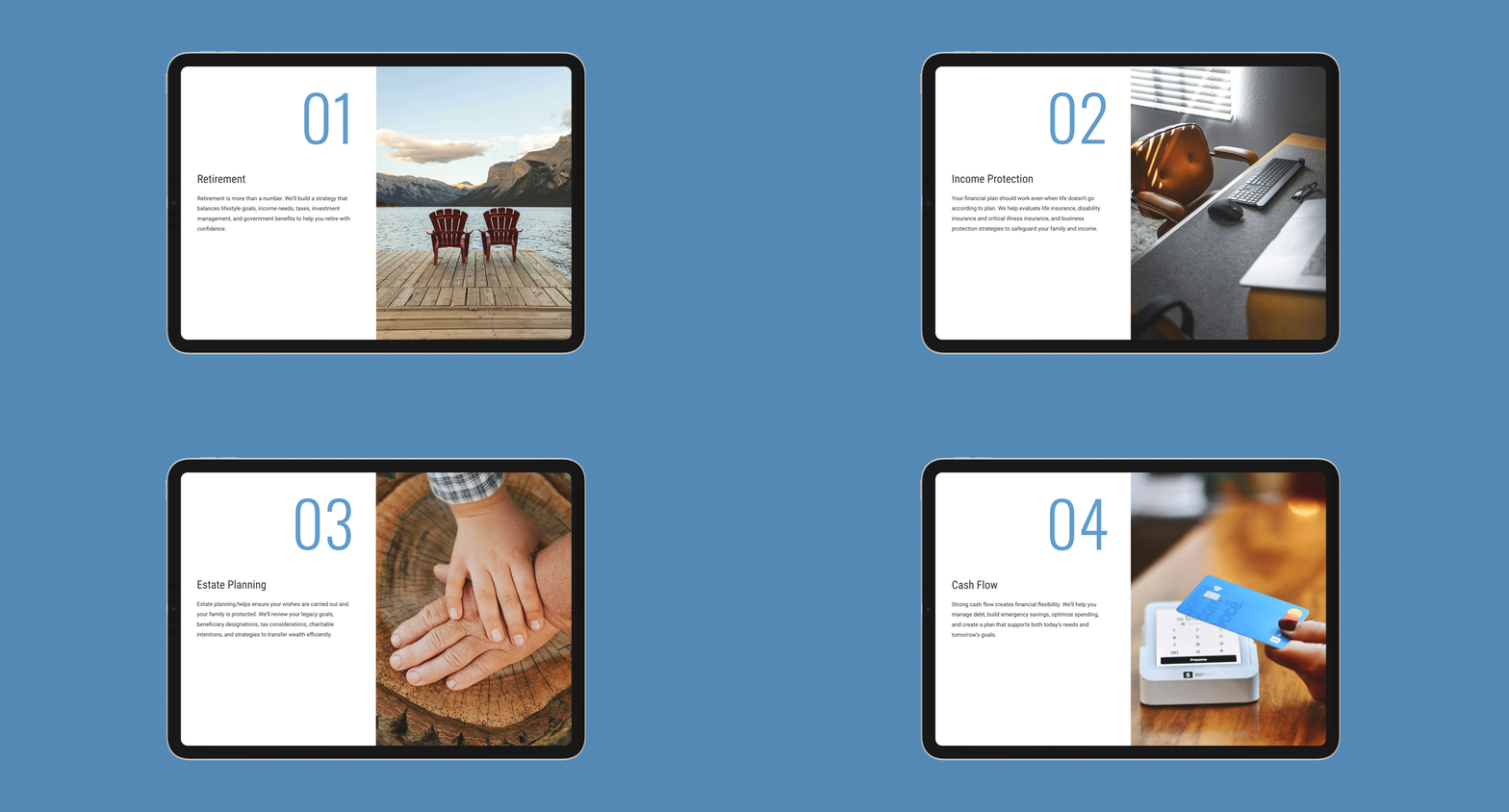
The site needed to clearly communicate TruePlan’s services, build trust and present the business with the same level of professionalism as the advice it provides. The result is a clean, approachable one-page site that builds on the existing brand and gives TruePlan a stronger digital presence, with room to grow over time.
When the time came to design the website, that same idea provided a natural creative direction. Mountain landscapes, pathways and views into the distance reinforce themes of clarity, perspective and long-term planning, while creating a visual connection back to the logo.
The site needed to clearly communicate TruePlan’s services, build trust and present the business with the same level of professionalism as the advice it provides. The result is a clean, approachable one-page site that builds on the existing brand and gives TruePlan a stronger digital presence, with room to grow over time.